This part is painful. Mainly because I use a cheap flatbed scanner. I scan the comic into the computer in about 6 parts at 300dpi. Since the comic is 15 inches square, that brings the final image to 4500x4500 pixels. Coffee mugs stand at the ready as I prepare to paint long into the night.
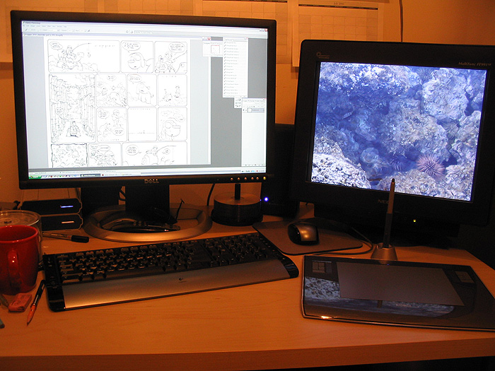
Here's my current desktop set-up. The machine is a Pentium Intel D 830 (3 ghz dualcore processor) with 2 gb of RAM, an ATI Radeon 9550, and 250 gig Serial ATA hard drive. The monitors are a 24-inch Dell Ultrasharp LCD and a 19-inch NEC CRT. I use dual monitors to do color checks on the files (LCD and CRT), but that's pretty much it. For peripherals, I use a Wacom Intuos3 6x8 tablet and a Logitech wireless keyboard and mouse. By the way, you don't need all this fancy stuff. This is something I only recently invested in to work on Amulet and the new volumes of Flight. I had been doing fine with a 1.2 ghz AMD with 768 megs of RAM and a hand-me-down Geforce 4 video card for the past several years. It feels pretty sweet to be finally working on nice machinery, though.
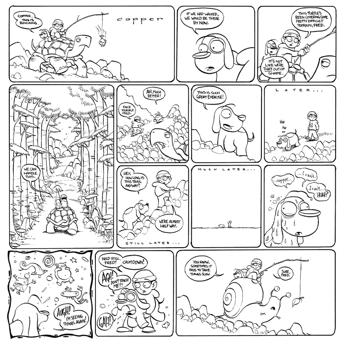
After scanning the comic in 5 to 6 pieces in Adobe Photoshop CS1 at 300dpi and in RGB color, I re-assemble the comic and then blast out all the paper texture and blue lines. I forgot to take screen shots of this process, but I essentially just use Image>Adjustments>Hue/Saturation, select the Cyan and Blue levels, then take the lightness all the way to +100 on each, to get rid of any traces of blue. I then turn it into a grayscale image, go to Image>Adjustments>Threshold... and turn the image into a pure black and white image. This will make color selections far easier than if the lines were anti-aliased.
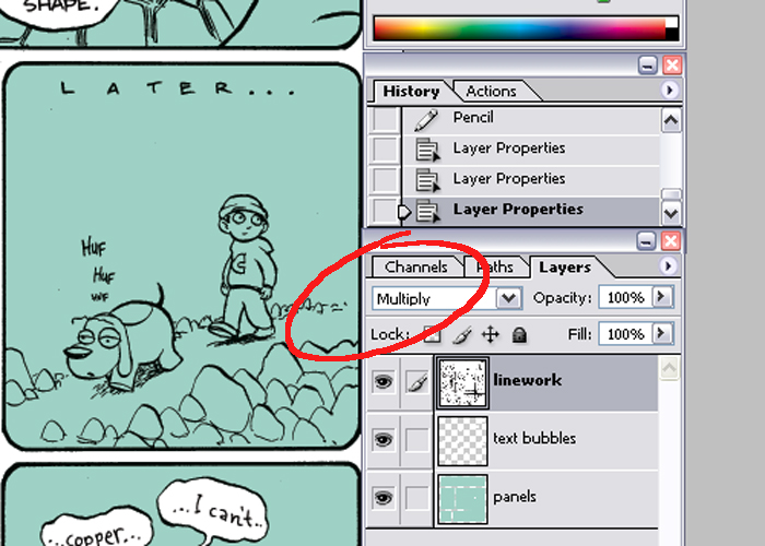
I begin the coloring process by going to Image>Mode>CMYK to make it a CMYK file, then I create two new layers. By double-clicking the background layer (the original scan) you can turn it into a regular layer and bring it to the top. I also rename it to keep things clean. Setting the linework layer to "Multiply" will allow for the white areas to become see-through while the blacks will stay visible.
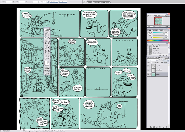
Since I work on mostly flattened layers in Copper (unlike my other comics), this process is really only good for filling the panel areas with color and keeping the text bubbles white. I do this by filling one layer with a color (in this case, light green), then selecting outside the panel borders using the linework layer to delete any excess. I also select the text bubbles, and fill them with white on their own layer.
The color is added so that I have an easier time shading the comic. It's really difficult to just drop colors onto a blank canvas, and when you do that, it tends to look a bit too kaleidoscopic. By setting down a midtone and then working away from it, you get a more cohesive looking piece.

Using the linework layer to select the text bubbles will inevitably leave areas inside the text unselected, so I turn off the linework layer and paint over the empty letter spaces with the pencil tool, set to white.

Again, because Copper is done on mostly flat layers, I will flatten the image after I'm done cleaning the text bubbles. The above process is much more useful on comics with separated linework and when coloring with gradation. Creating a system for easy selection of individual components will make color adjustments a whole lot easier. Since, with Copper, I will only be using the pencil and paint bucket tools on a purely black and white image with no anti-aliasing, it will only be a matter of selecting any color or shape with the magic wand tool to make a perfect selection of that region.
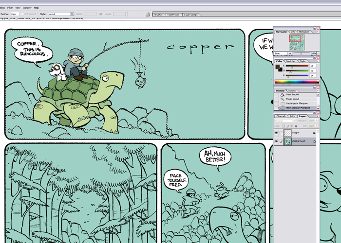
Case in point, here the light green region is selected easily by using the magic wand tool, clicking off the 'contiguous' option on the top toolbar, and selecting the light green. It makes painting around intricate linework very easy. Remember, as stated above, this is very particular to the style of this comic. I would generally recommend people work on multiple layers. Since Copper is an exercise in restraint, I just choose to do it this way.

Typing Ctrl+H will hide the ant trails created by your selection to allow for easier painting of the panels. At this point, I use a combination of dropping the paint bucket on areas that I can tell are fully enclosed by black lines, and by selecting large regions using the magic wand tool (with contiguous selection turned off) and painting with the pencil tool.

One of the best reasons for setting up a system for easy selection of individual components (like characters, objects, backgrounds, etc.) is so that you can adjust the colors of those elements without affecting the rest of the piece. Here, I am using the Hue/Saturation adjust to change the color of the turtle. This is where I spend a lot of time working on Copper. Color selection. Finding a suitable color palette takes more time than anything else. Thankfully, easy selection of the individual parts makes this process a bit easier.

Unlike the inking process, the order in which I paint each panel is a little more haphazard here. I tend to just go to the panels that most interest me then base the feeling of the other panels off those. Here, it's apparent that I was most jazzed about painting the fourth and first panels, in that order. The rest of the comic conforms to those two. Finishing up the other panels can be quite a chore. Coffee and music can become very good friends.

Now, with my extra fancy set-up, I can see how the colors look on both an LCD and a CRT monitor. This step is not really necessary, especially if you have a pretty accurate monitor like the Dell Ultrasharp. Everything I do on that monitor tends to look okay on most other monitors. It's amazing I worked on that poopy CRT monitor for so many years. The image looks really fuzzy and very blue at right.

To finish up the coloring job, I select the black line using the magic wand tool (with contiguous selection turned off) and go over any areas that don't require the lines, like on Fred's patches, or the big 'C' on Copper's hoodie. Sometimes, I even color the lines to create more depth or just stylize the comic a bit. An example of colored lines can be found here, and here.
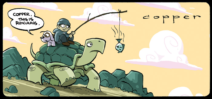
Well, that about covers the process for making a Copper comic. You can find the final comic right here. I hope that was somewhat informative, and to everyone who has been reading and supporting Copper for the past few years - Thanks! :D
Go to the Copper homepage
Go Back to part 1: PENCILLING!or go back to:


